3 Visualize
Learning Objectives
Read data table.
Get paths using
here::here().Use
readr::read_csv()instead ofread.csv(). Read CSV directly from URL.
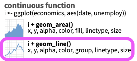
Plot with
ggplot2using grammar of graphics:Starting with a simple line plot, feed the data as the first argument, set the aesthetics
aes(x = time, y = revenue)and add geometry type of line+ geom_line().Add a smooth layer
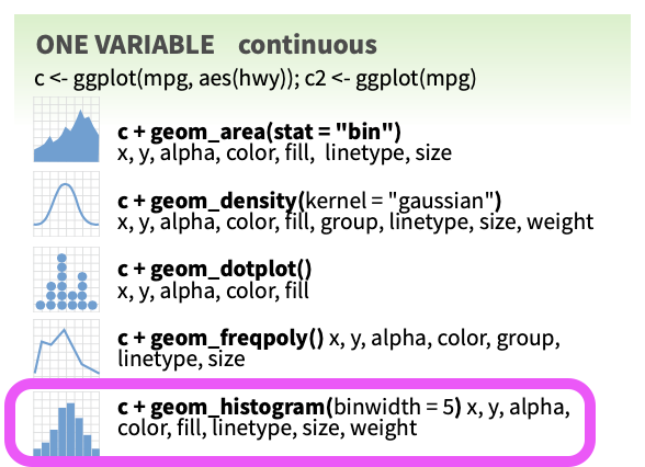
+ geom_smooth()for visualizing trend.Plot a histogram
geom_histogram().Plot a series of data using aesthetic of color
aes(color = region).Update labels
+ labs()Generate multiple plots based on a variable with
+ facet_wrap().Show variation with a box plot
+ geom_boxplot().Show variation with a violin plot
+ geom_violin().Change the
theme(), eg withtheme_classic().
Create interactive online plots using htmlwidgets R libraries:
plotly::ggplotly()to convert existing ggplot object to interactive plotly visualization.dygraphslibrary for time series plots.
3.1 Read Data
Open your r3-exercises.Rproj to launch RStudio into that project and set the working directory.
Create a new Rmarkdown file (RStudio menu File > New file > Rmarkdown…) called visualize.Rmd. Insert headers like last time followed by Chunks of R code according to the examples provided below.
I’ll be copy/pasting during the demonstration but I encourage you to type out the text to enhance understanding.
Picking up with the table we downloaded last time (2.1.4 Read table read.csv()), let’s read the data directly from the URL and use readr’s read_csv():
# libraries
library(here)
library(readr)
library(DT)

# variables
url_ac <- "https://oceanview.pfeg.noaa.gov/erddap/tabledap/cciea_AC.csv"
# if ERDDAP server down (Error in download.file) with URL above, use this:
#    url_ac <- "https://raw.githubusercontent.com/noaa-iea/r3-train/master/data/cciea_AC.csv"
csv_ac <- here("data/cciea_AC.csv")

# download data
if (!file.exists(csv_ac))
  download.file(url_ac, csv_ac)

# read data
d_ac        <- read_csv(csv_ac, col_names = F, skip = 2)
names(d_ac) <- names(read_csv(csv_ac))

# show data
datatable(d_ac)
Note the use of functions in libraries here and readr that you may need to install from the Packages pane in RStudio.
There here::here() function starts the path based on looking for the *.Rproj file in the current working directory or higher level folder. In this case it should be the same folder as your current working directory so seems unnecessary, but it’s good practice for other situations in which you start running Rmarkdown files stored in subfolders (in which case the evaluating R Chunks assume the working directory of the .Rmd).
I prefer readr::read_csv() over read.csv() since columns of character type are not converted to type factor by default. It will also default to being read in as a tibble rather than just a data.frame.
3.2 Plot statically with ggplot2
3.2.1 Simple line plot + geom_line()
Let’s start with a simple line plot of total_fisheries_revenue_coastwide (y axis) over time (x axis) using the grammar of graphics principles by:
- Feed the data as the first argument to
ggplot(). - Set up the aesthetics
aes()as the second argument for specifying the dimensions of the plot (xandy). - Add (
+) the geometry, or plot type.
From the Data Visualization with ggplot2 Cheatsheet (RStudio menu Help > Cheat Sheets), we have these aesthetics to plot based on the value being continuous
library(dplyr)
library(ggplot2)

# subset data
d_coast <- d_ac %>%
  # select columns
  select(time, total_fisheries_revenue_coastwide) %>%
  # filter rows
  filter(!is.na(total_fisheries_revenue_coastwide))
datatable(d_coast)
# ggplot object
p_coast <- d_coast %>%
# setup aesthetics
ggplot(aes(x = time, y = total_fisheries_revenue_coastwide)) +
# add geometry
geom_line()
# show plot
p_coast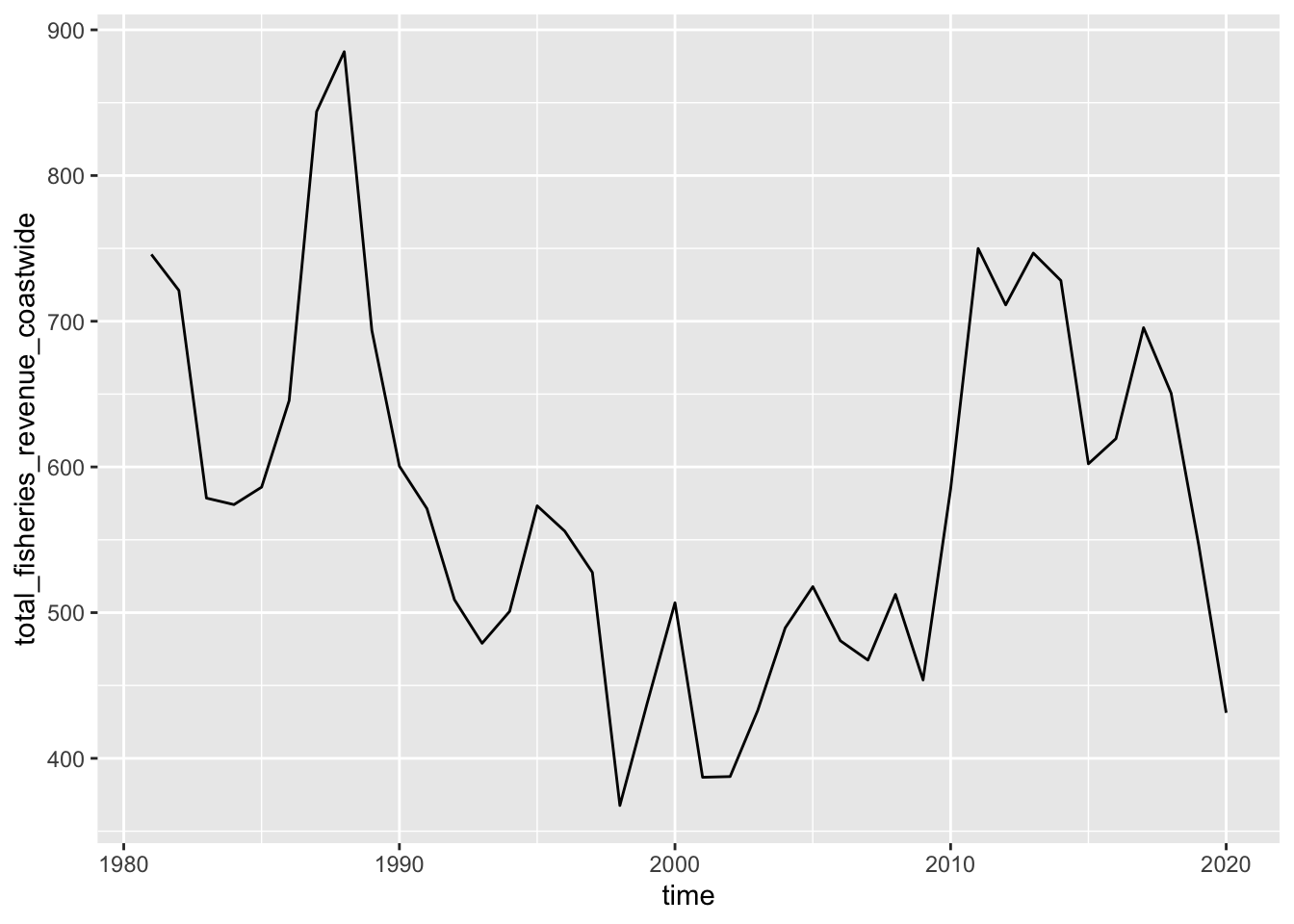
3.2.2 Trend line + geom_smooth()
Add a smooth layer based on a linear model (method = "lm").
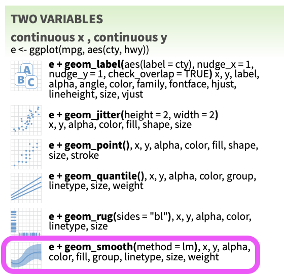
p_coast +
  geom_smooth(method = "lm")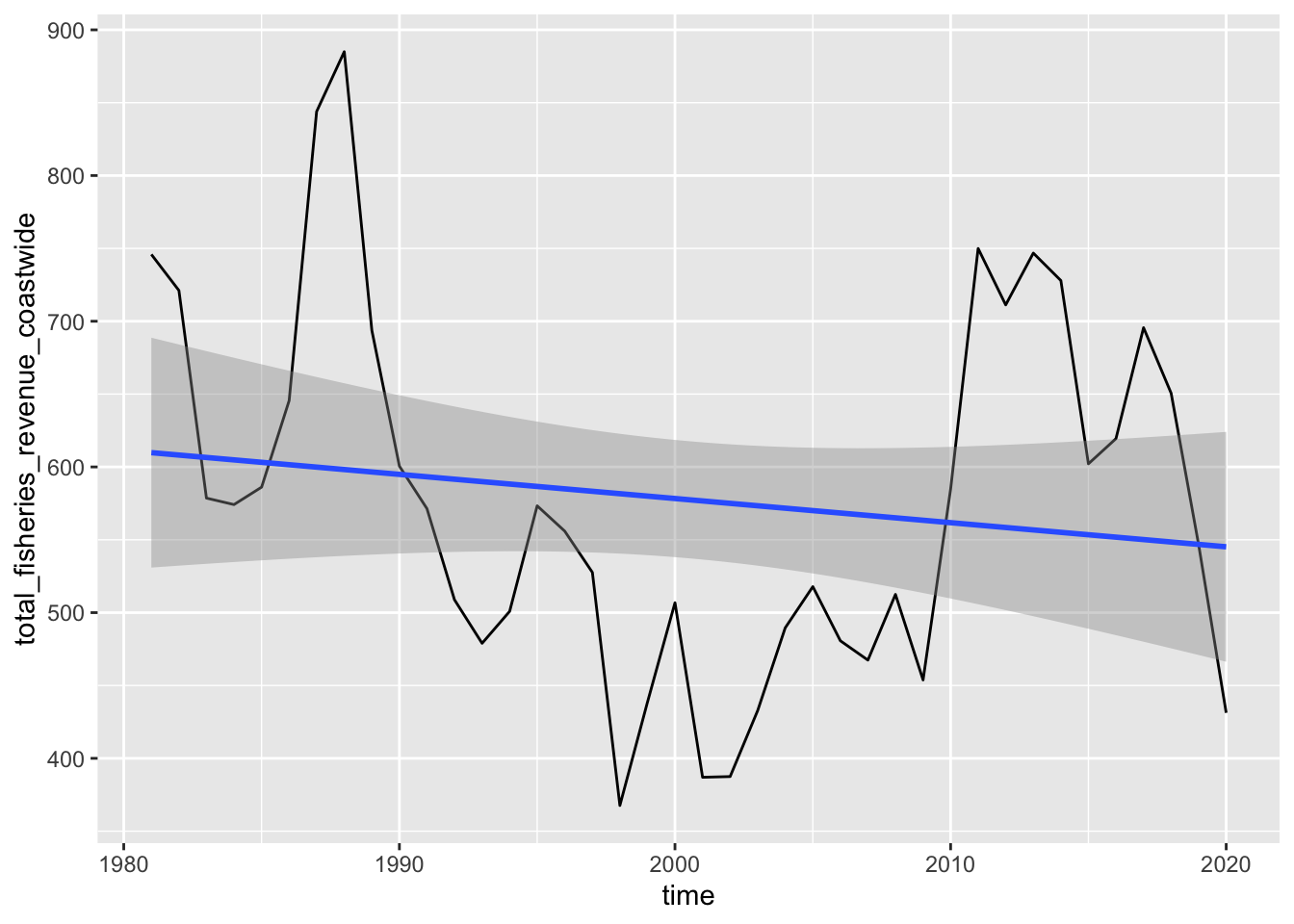
Try changing the method argument by looking at the help documentation ?geom_smooth.
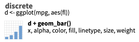
3.2.3 Distribution of values + geom_histogram()
What if you want to look at a distribution of the values? For instance, you might simulate future revenues by drawing from this distribution, in which case you would want to use geom_histogram().
d_coast %>%
  # setup aesthetics
  ggplot(aes(x = total_fisheries_revenue_coastwide)) +
  # add geometry
  geom_histogram()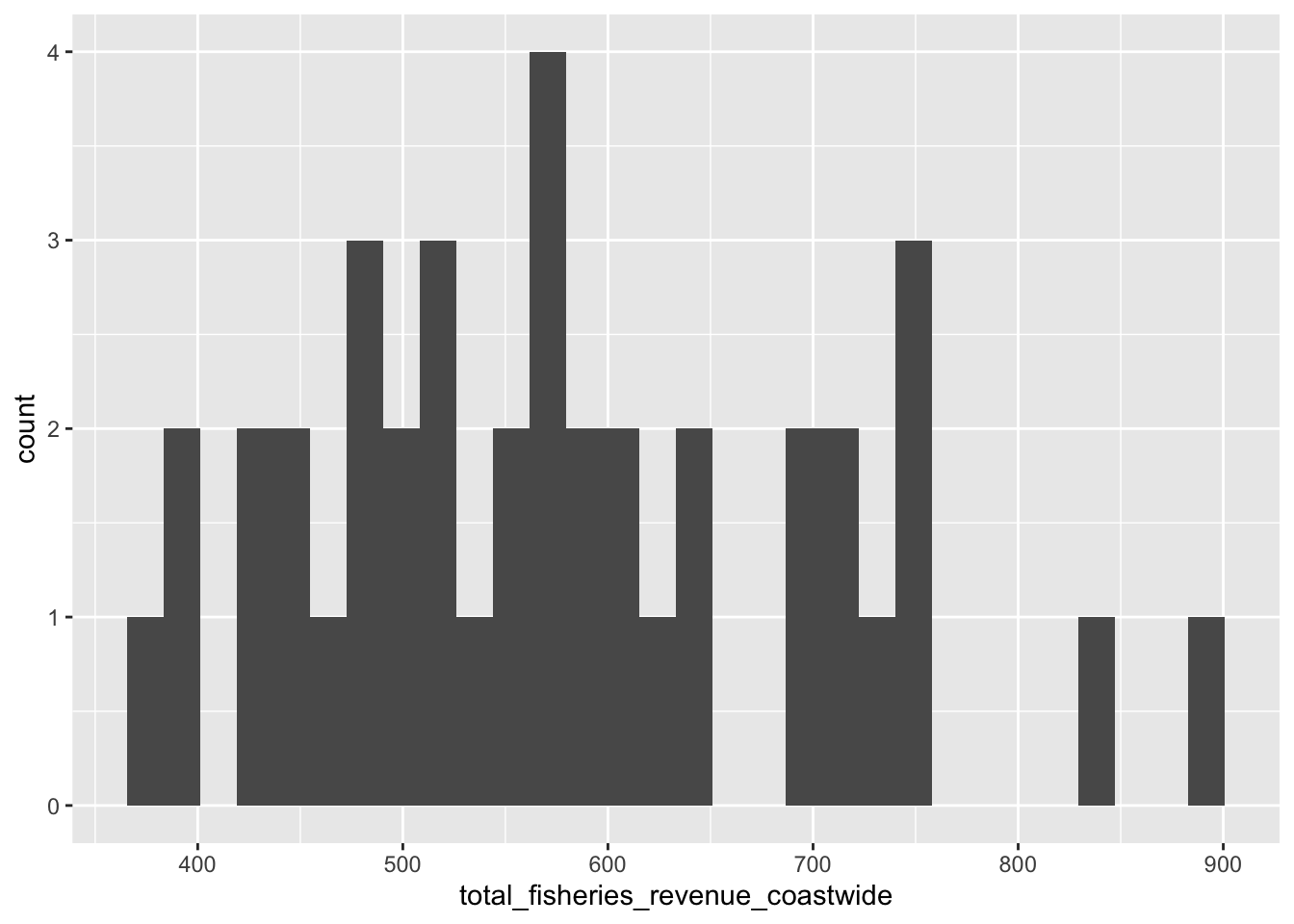
Try changing the binwidth parameter.
3.2.4 Series line plot aes(color = region)
Next, let’s also show the other regional values (CA, OR and WA; not coastwide) in the plot as a series with different colors. To do this, we’ll want to tidy the data into long format so we can have a column for total_fisheries_revenue and another region column to supply as the group and color aesthetics based on aesthetics we see are available for geom_line():
library(stringr)
library(tidyr)

d_rgn <- d_ac %>%
  # select columns
  select(
    time,
    starts_with("total_fisheries_revenue")) %>%
  # exclude column
  select(-total_fisheries_revenue_coastwide) %>%
  # pivot longer
  pivot_longer(-time) %>%
  # mutate region by stripping other
  mutate(
    region = name %>%
      str_replace("total_fisheries_revenue_", "") %>%
      str_to_upper()) %>%
  # filter for not NA
  filter(!is.na(value)) %>%
  # select columns
  select(time, region, value)

# create plot object
p_rgn <- ggplot(
  d_rgn,
  # aesthetics
  aes(
    x     = time,
    y     = value,
    group = region,
    color = region)) +
  # geometry
  geom_line()

# show plot
p_rgn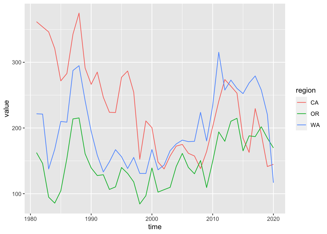
3.2.5 Update labels + labs()
Next, let’s update the labels for the title, x and y axes, and the color legend:
p_rgn <- p_rgn +
  labs(
    title  = "Fisheries Revenue",
    x      = "Year",
    y      = "Millions $ (year 2015)",
    color  = "Region")
p_rgn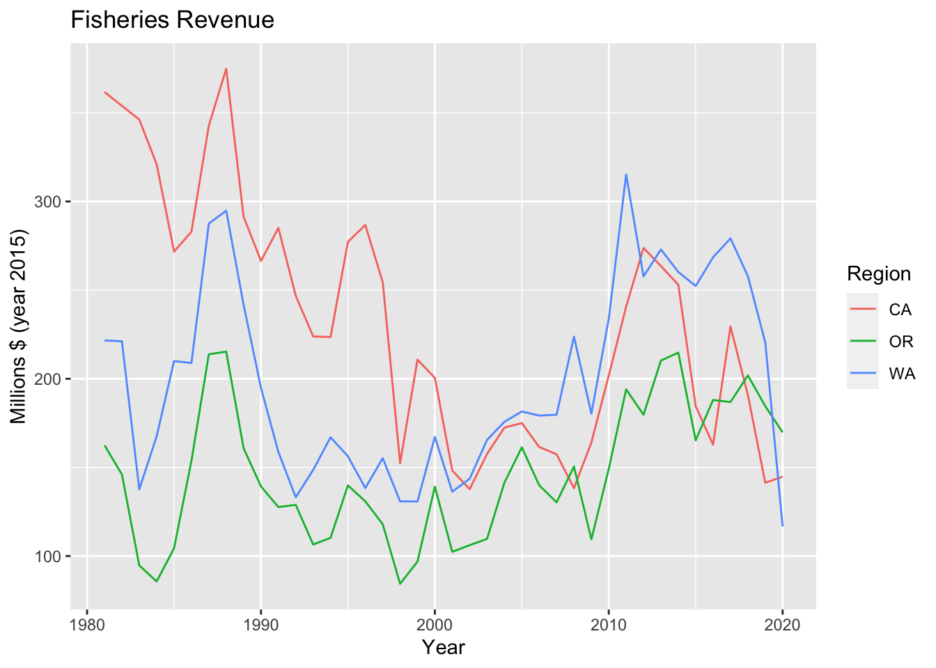
3.2.6 Multiple plots with facet_wrap()
When you want to look at similar data one variable at a time, you can use facet_wrap() to display based on this variable.
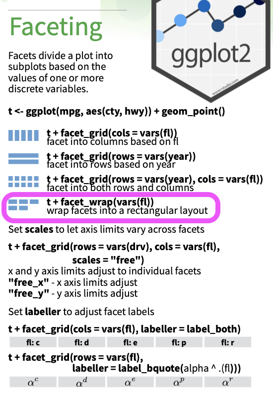
p_rgn +
  facet_wrap(vars(region))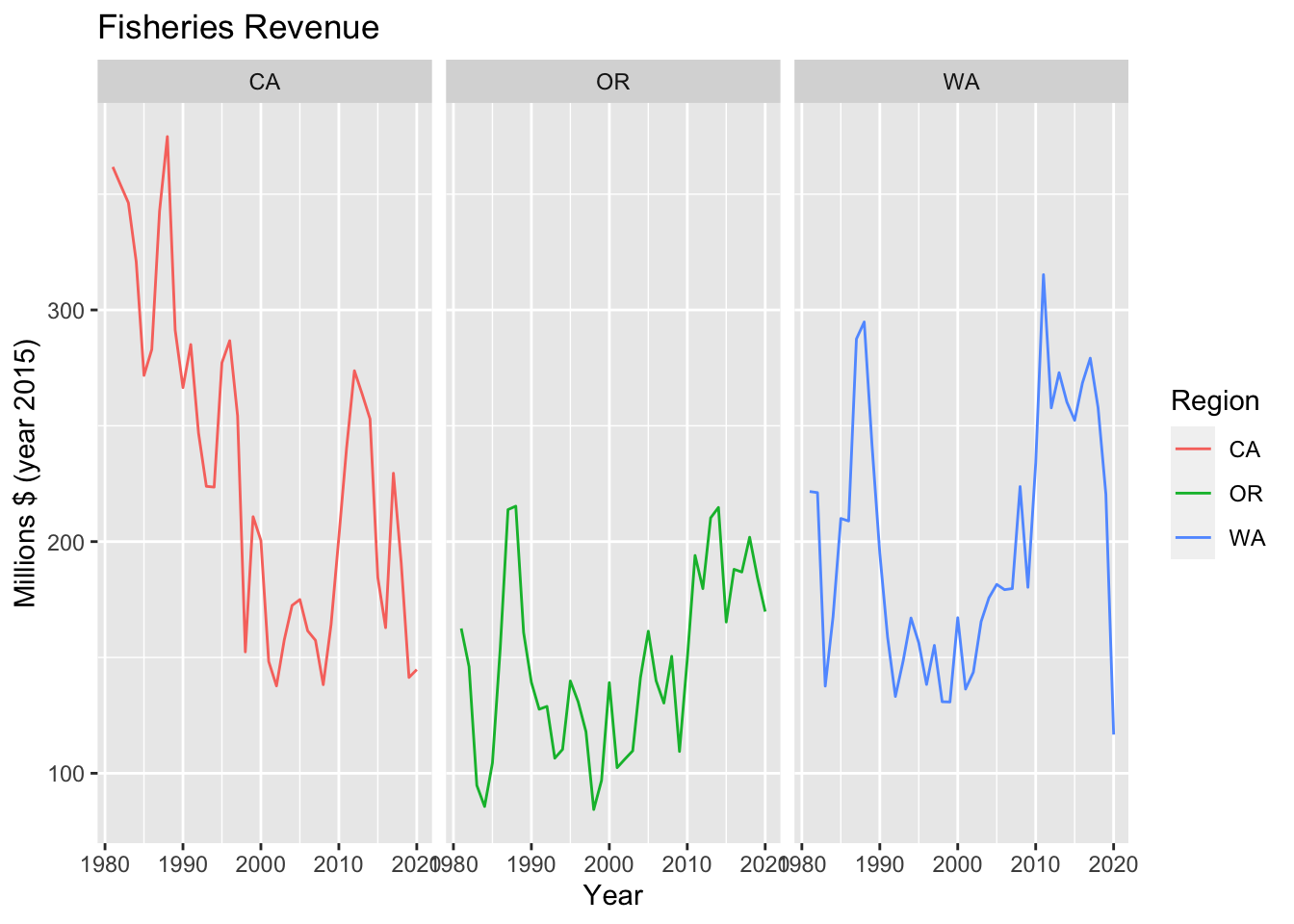
The example above is not a very good one since you’d typically show facets based on a variable not already plotted.
3.2.7 Bar plot + geom_col()
Another common visualization is a bar plot. How many variables does geom_bar() use versus geom_col()?
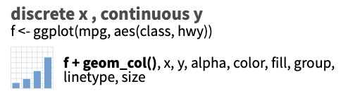
library(glue)
library(lubridate)

yr_max <- year(max(d_rgn$time))

d_rgn %>%
  # filter by most recent time
  filter(year(time) == yr_max) %>%
  # setup aesthetics
  ggplot(aes(x = region, y = value, fill = region)) +
  # add geometry
  geom_col() +
  # add labels
  labs(
    title  = glue("Fisheries Revenue for {yr_max}"),
    x      = "Region",
    y      = "Millions $ (year 2015)",
    fill   = "Region")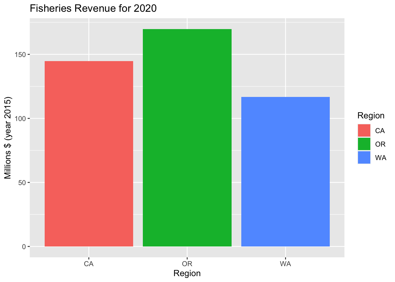
Try using color instead of fill within the aesthetic aes(). What’s the difference?
3.2.8 Variation of series with + geom_boxplot()
d_rgn %>%
  # setup aesthetics
  ggplot(aes(x = region, y = value, fill = region)) +
  # add geometry
  geom_boxplot() +
  # add labels
  labs(
    title  = "Fisheries Revenue Variability",
    x      = "Region",
    y      = "Millions $ (year 2015)") +
  # drop legend since redundant with x axis
  theme(
    legend.position = "none")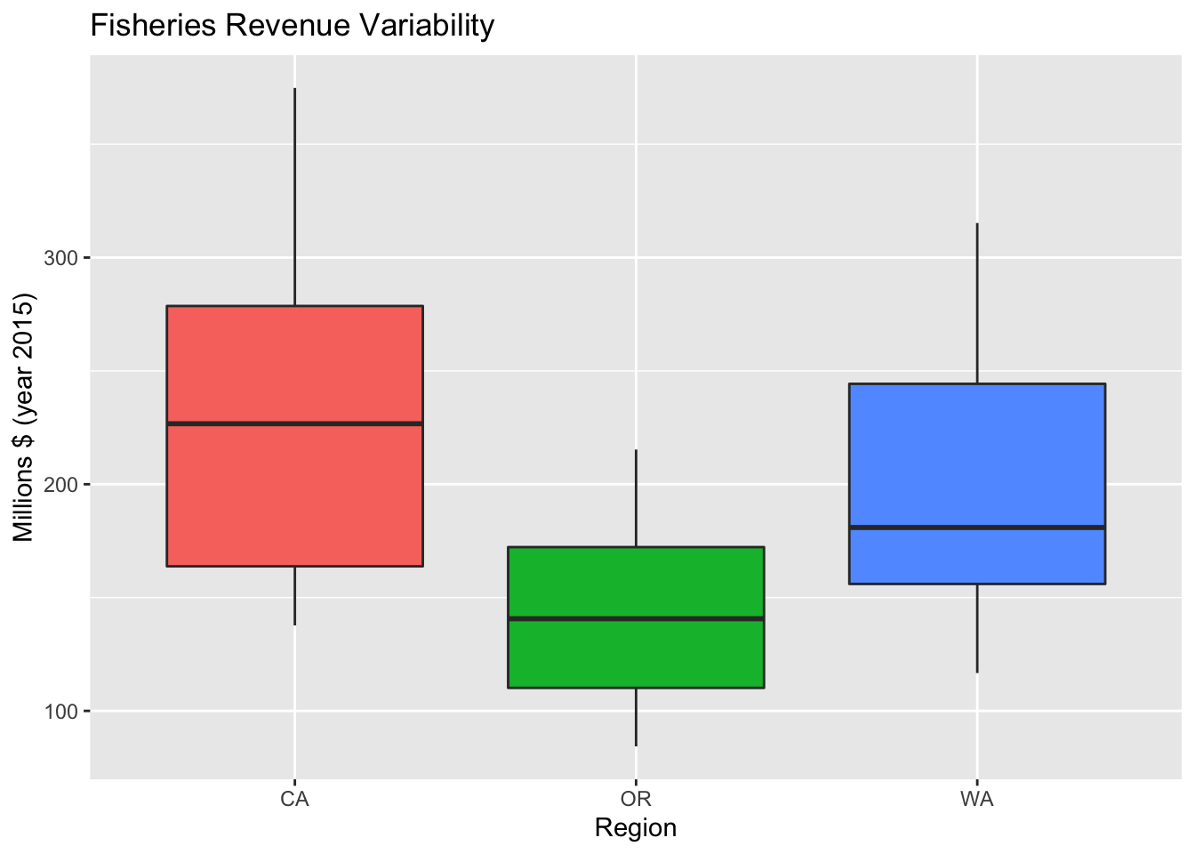
3.2.9 Variation of series with + geom_violin()
p_rgn_violin <- d_rgn %>%
  # setup aesthetics
  ggplot(aes(x = region, y = value, fill = region)) +
  # add geometry
  geom_violin() +
  # add labels
  labs(
    title  = "Fisheries Revenue Variability",
    x      = "Region",
    y      = "Millions $ (year 2015)") +
  # drop legend since redundant with x axis
  theme(
    legend.position = "none")
p_rgn_violin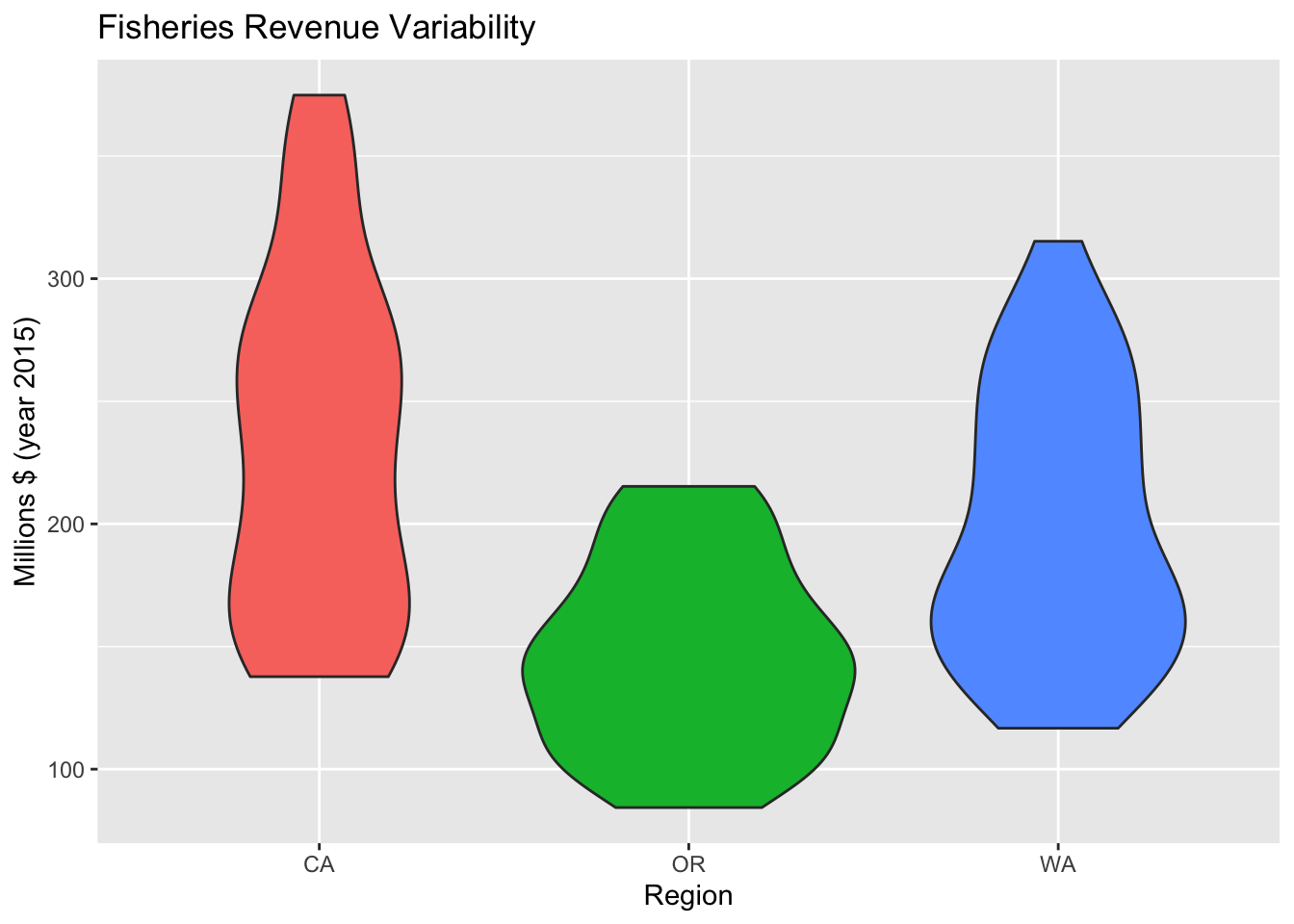
3.2.10 Change Theme theme()
We’ve already manipulated the theme() in dropping the legend. You can create your own theme or use some of the existing.
p_rgn_violin +
  theme_classic()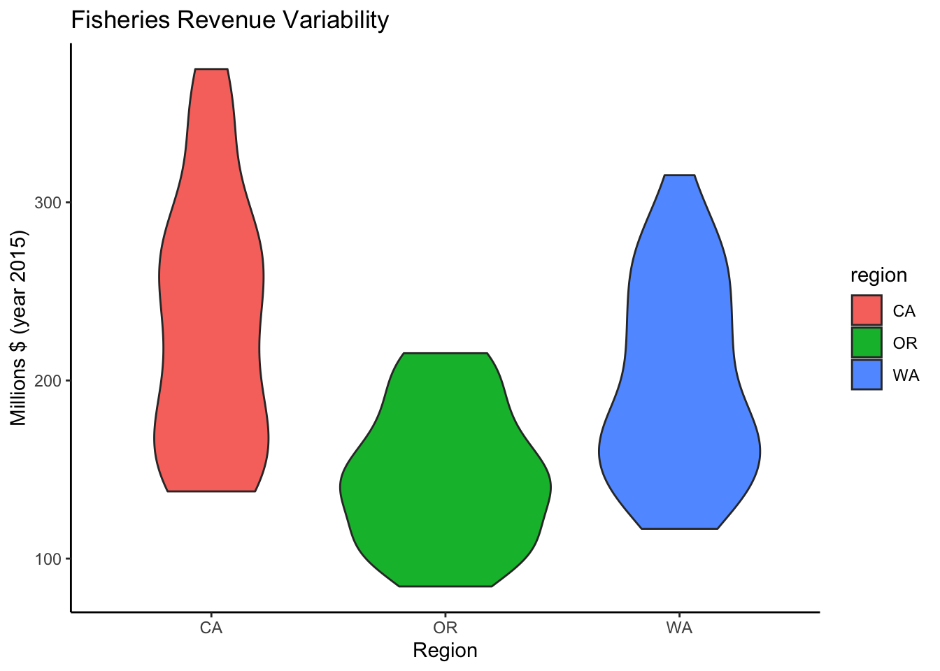
3.3 Plot interactively with plotly or dygraphs
3.3.1 Make ggplot interactive with plotly::ggplotly()
When rendering to HTML, you can render most ggplot objects interactively with plotly::ggplotly(). The plotly library is an R htmlwidget providing simple R functions to render interactive JavaScript visualizations.
plotly::ggplotly(p_rgn)Interactivity. Notice how now you can see a tooltip on hover of the data for any point of data. You can also use plotly’s toolbar to zoom in/out, turn any series on/off by clicking on item in legend, and download a png.
3.3.2 Create interactive time series with dygraphs::dygraph()
Another htmlwidget plotting library written more specifically for time series data is dygraphs. Unlike the ggplot2 data input, a series is expected in wide (not tidy long) format. So we use tidyr’s pivot_wider() first.
library(dygraphs)

d_rgn_wide <- d_rgn %>%
  mutate(
    Year = year(time)) %>%
  select(Year, region, value) %>%
  pivot_wider(
    names_from  = region,
    values_from = value)
datatable(d_rgn_wide)
d_rgn_wide %>%
dygraph() %>%
dyRangeSelector()Further Reading
Introductory ggplot2 topics not yet covered above are:
Other plot types: scatter, area, polar, ….
Changing scales of axes, color, shape and size with
scale_*()functions.Transforming coordinate system, eg
coord_flip()to swap x and y axes for different orientation.Adding text annotations.
Changing margins.
Summarization methods with
stat_*()functions.
Here are further resources:
- Learning ggplot2 | ggplot2
- ggplot2: Elegant Graphics for Data Analysis: online book by Hadley Wickham
- 3. Data visualisation | R for Data Science: chapter from online book by Hadley Wickham and Garrett Grolemund
- R Graphics Cookbook, 2nd edition